Heavy Metal Design Logo Refresh
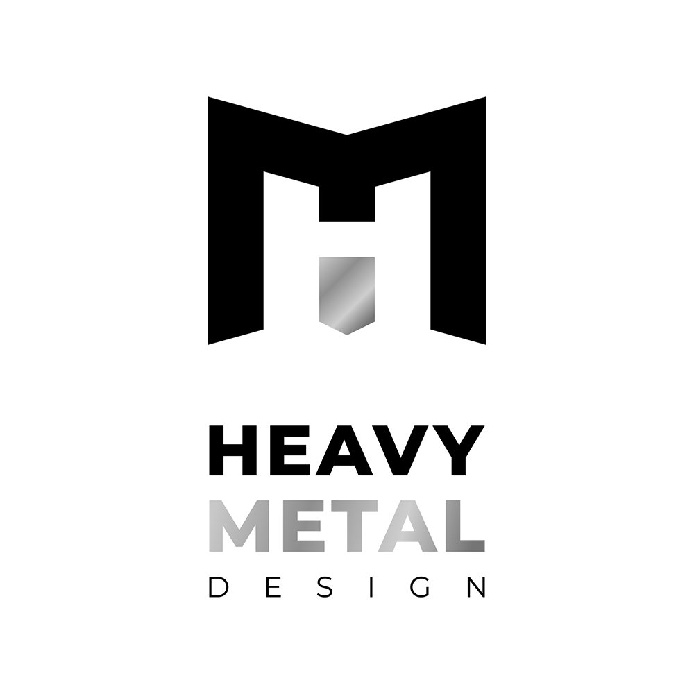
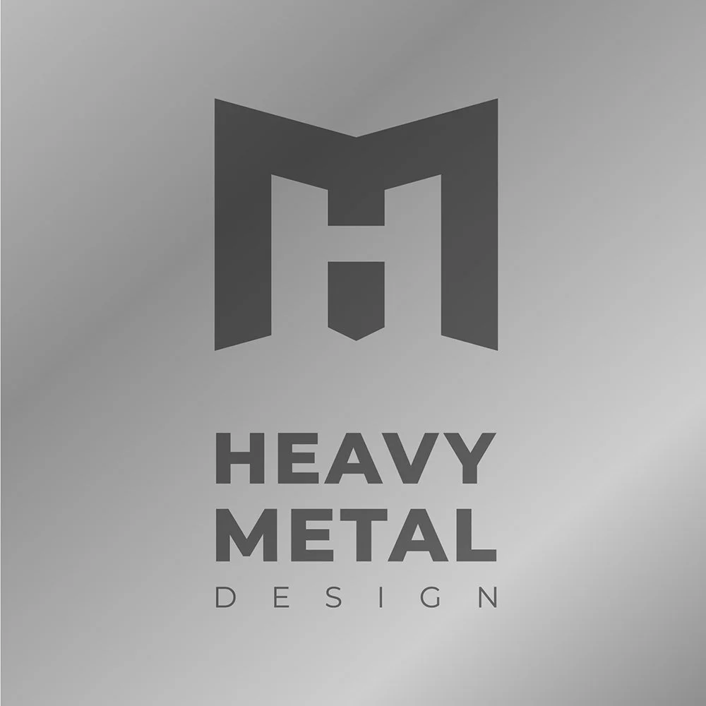
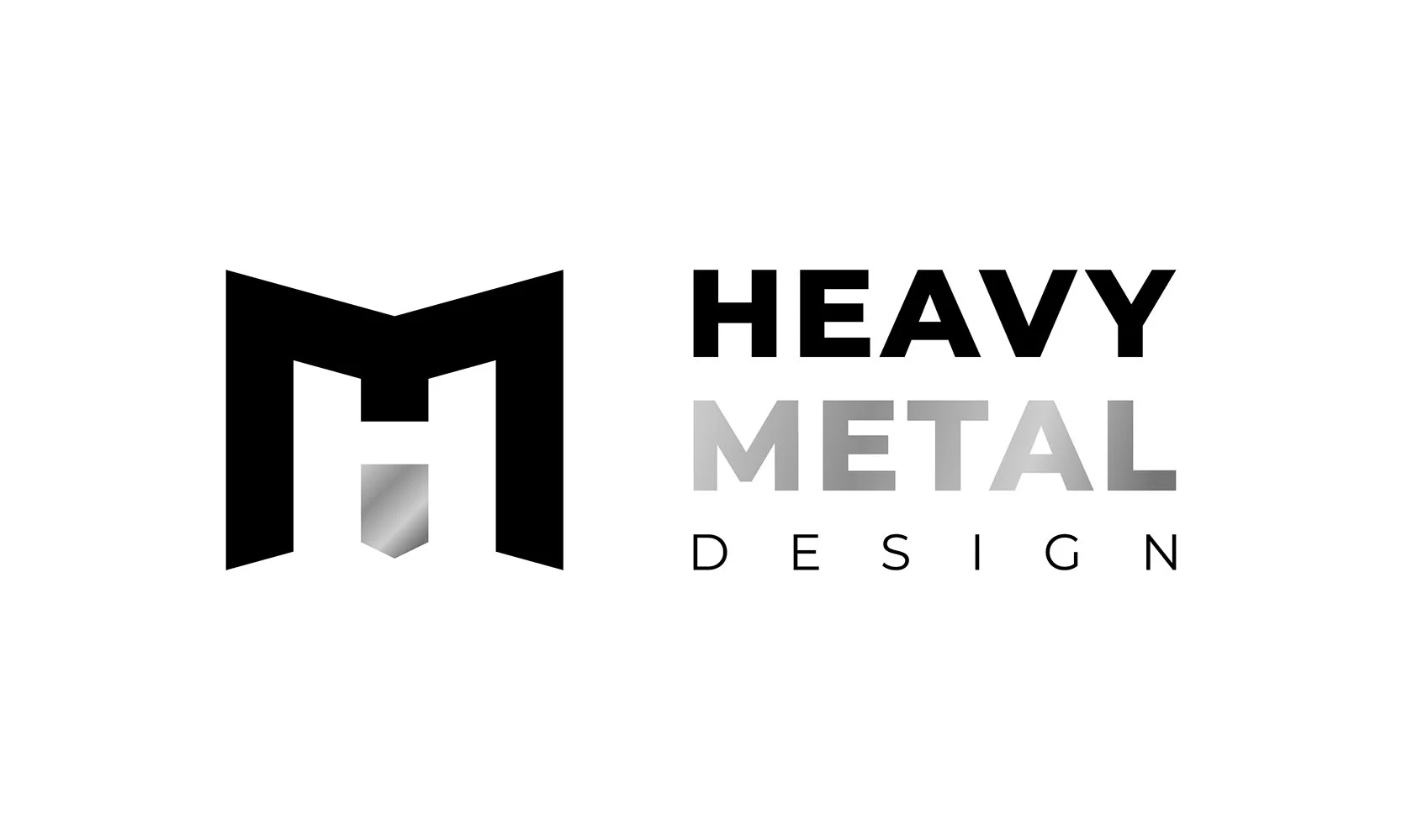
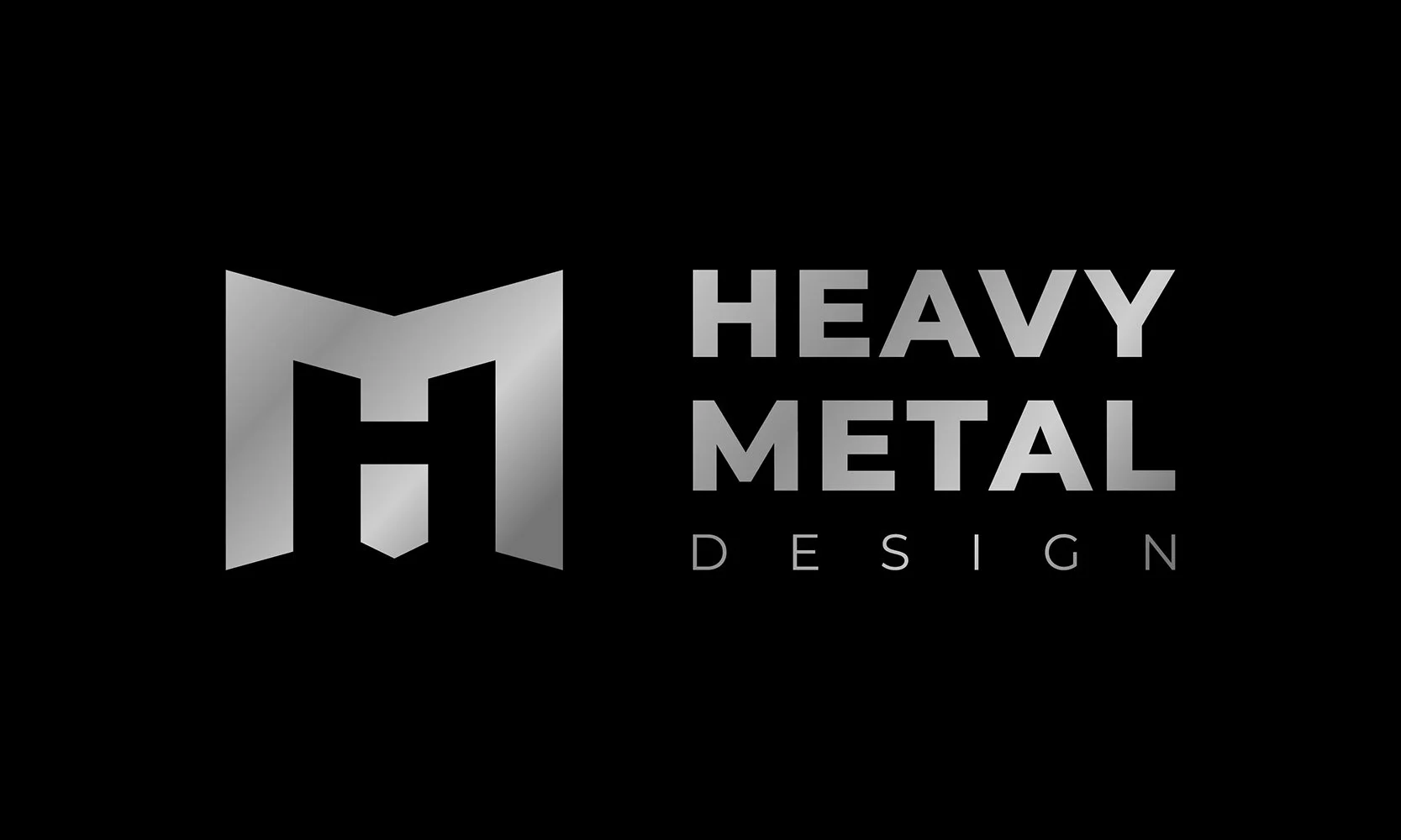
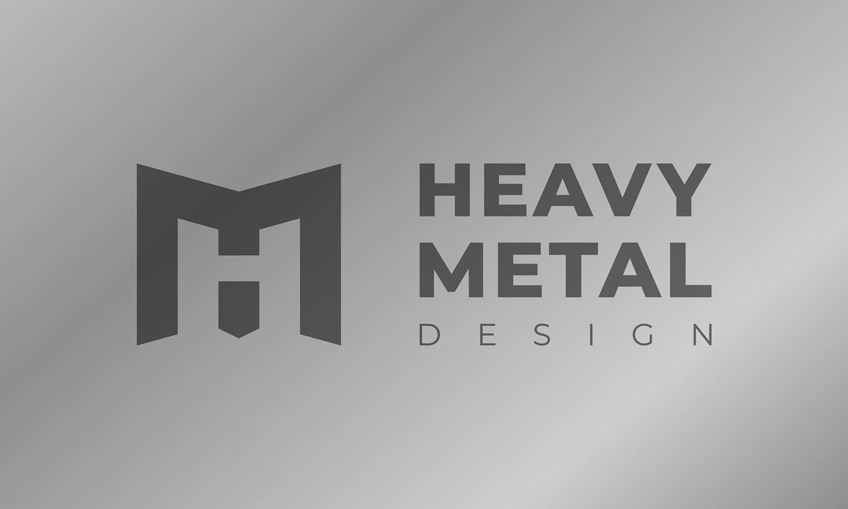
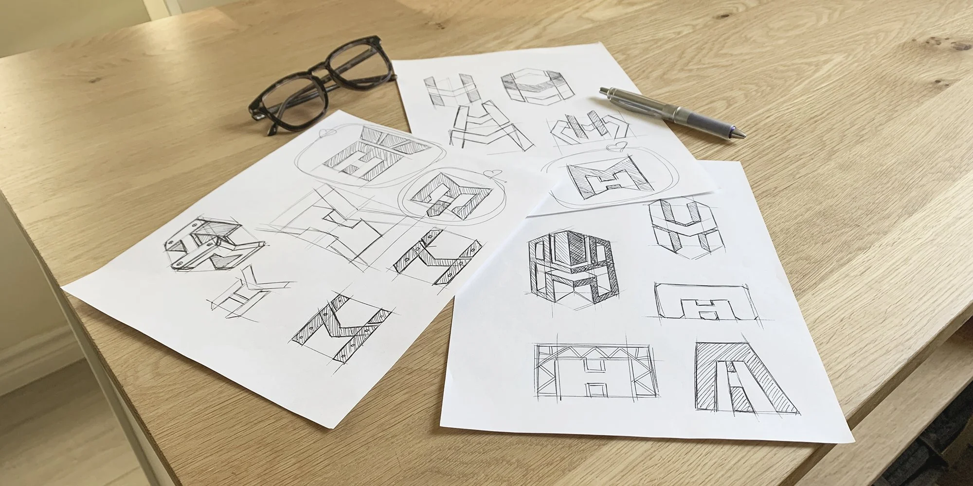
I came across a company online that designs and manufactures custom steel structures, sculptures and fixtures, and immediately wanted to redesign their logo. In my opinion logos should always visually describe the company, and almost always appear visually clean, minimal, to allow them to stand the test of time. Without a proper project brief, I wanted to ask one simple question. If I was operating the company, what would I want the logo to look like? I started by sketching, focusing on a logo direction that implemented the H and M characters from the company name, working to combine them both with positive and negative space.
I started by sketching, focusing on a logo direction that implemented the H and M characters from the company name, working to combine them both with positive and negative space.
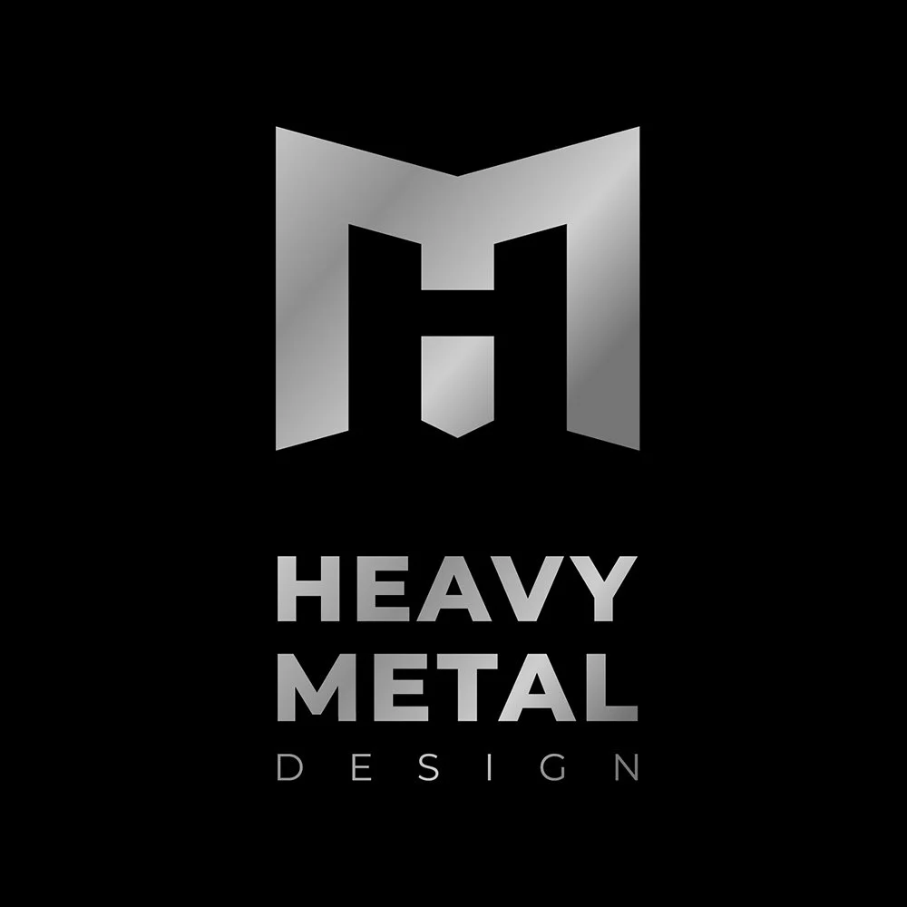
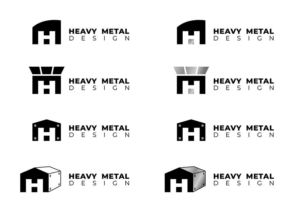
After selecting some of the sketch concepts that I felt had the right feel for the company, I moved into Adobe Illustrator and starting cleaning them up, detailing layout a bit more and trying some new ideas that popped up along the way. I also explored the use of metallic finishes that could be executed digitally or using metallic ink on print assets down the road.
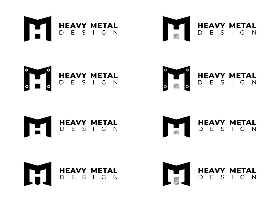
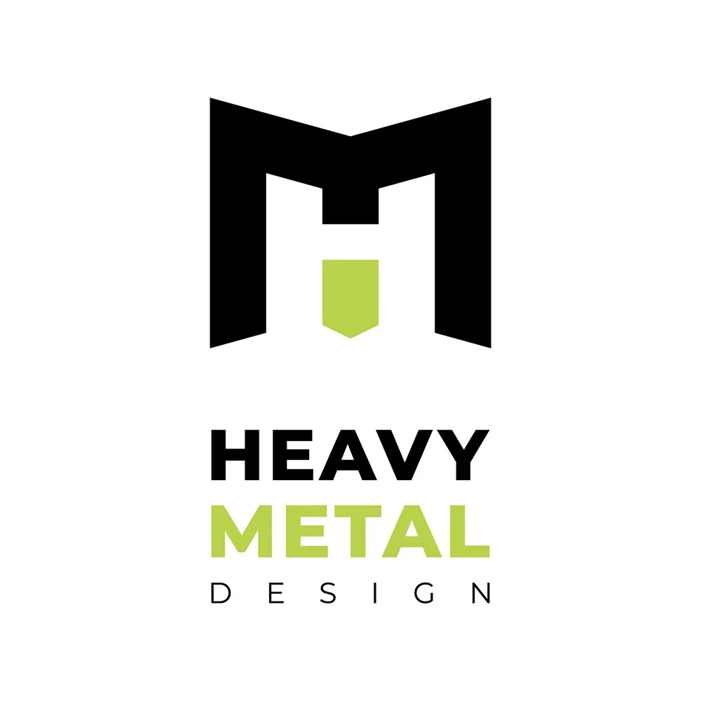
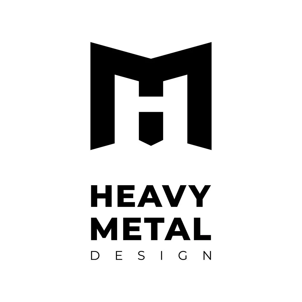
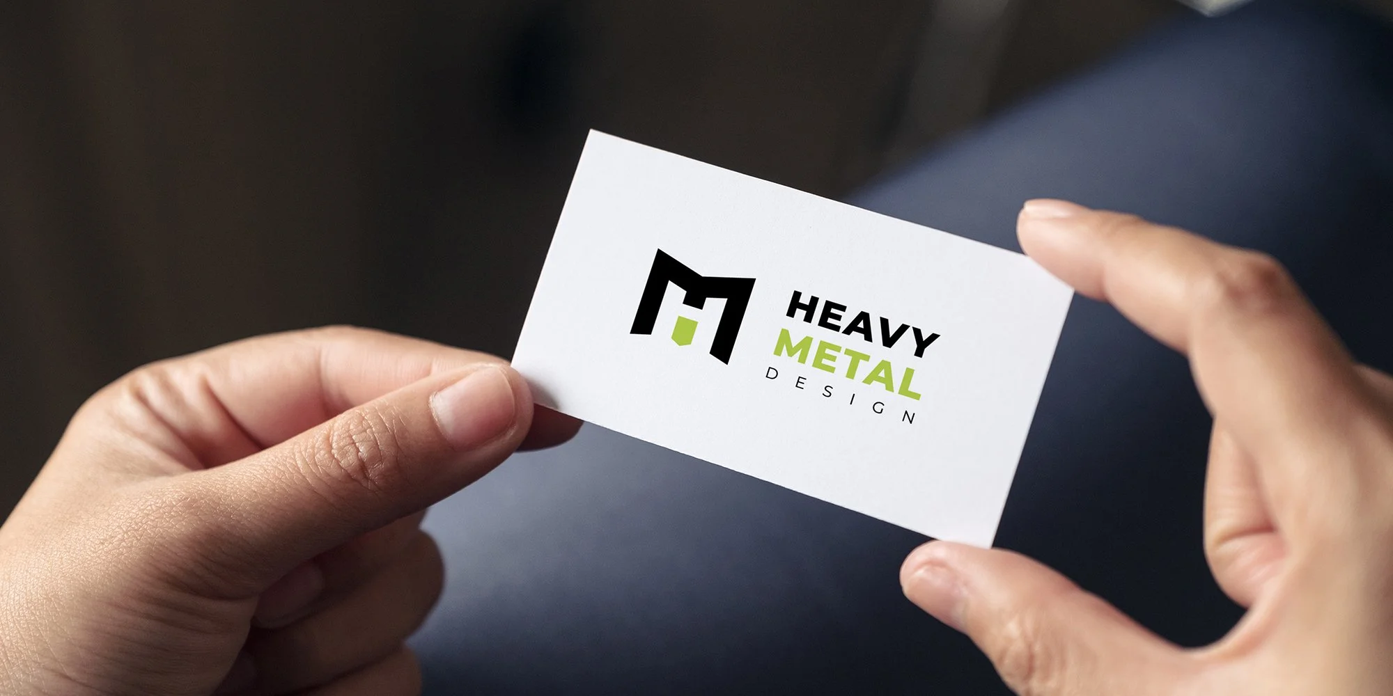
I chose to finalize the logo design with a clean and simple design using the M in black and the H in negative space. Mocking up the logo on white, black and metallic, as well as trying it out with pops of color, help present a much more finished look. At this stage I also scrutinize layout very closely after converting font to outline.